Overview
Rethinking how people discover products and connect with local markets.
Finding a product is only one part of the buying experience.
People also need to know where it's available, understand its specifications, and find the right person to help them complete a purchase.
OjaSure is a commerce platform designed around connecting buyers with products, markets, and people who can help facilitate their purchasing needs.
In 2025, I worked with the OjaSure team on a product redesign and mini-rebrand, focused on improving the visual identity and user experience across its mobile application and administrative dashboard.
The engagement involved revisiting the existing interface, improving navigation and information hierarchy, developing a more consistent visual language, and refining important product interactions.
My responsibilities covered brand exploration, interface design, component development, design-system work, stakeholder collaboration, and preparation for development handoff.
The challenge was to create a more coherent experience without losing the product's distinctive relationship with physical markets.
The goal was to make OjaSure easier to understand, easier to navigate, and more consistent across its digital touchpoints.
The Challenge
Making a marketplace feel as connected as the markets it serves.
Marketplaces bring together different kinds of information.
A buyer might be interested in a particular product, but the decision to proceed can depend on its specifications, where it is available, and who can help them obtain it.
Presenting this information clearly is especially important when the experience connects digital discovery with real-world markets.
For OjaSure, the design challenge extended beyond the appearance of individual screens.
The existing product needed a more consistent visual language, clearer navigation, and better organization of information across the mobile experience and admin dashboard.
The brand identity also needed refinement so that the product could present itself more consistently across interfaces and supporting materials.
These were connected problems.
A stronger visual identity would help establish recognition, but the interface still needed to support the actions users came to perform.
Likewise, improving individual screens would have limited value if the wider experience remained inconsistent.
Project objectives
01. Improve information hierarchy
Make important product information easier to identify and understand.
02. Strengthen navigation
Help users recognize where they are within the application and move between relevant sections.
03. Improve product discovery
Present product specifications, market availability, and related information more clearly.
04. Establish visual consistency
Create a cohesive design language across the mobile application, admin dashboard, and brand materials.
05. Support implementation
Develop reusable components and design documentation to make the redesigned experience easier to maintain and implement.
The central question
How might we make OjaSure's marketplace experience clearer and more intuitive while building a recognizable identity across the product?
My Approach
Bringing brand thinking and product usability into the same process.
I approached the engagement through discovery, visual exploration, interface evaluation, design refinement, and stakeholder review.
The project followed an approximately six-week design plan, with work progressing from initial research and brand exploration into interface redesign and handoff.
Stage 01 — Discovery and visual research
The first stage focused on understanding OjaSure's direction, target audience, and intended brand personality.
I explored visual references and developed moodboards to establish possible directions for the identity.
The objective was to create a brand that felt distinctive while remaining appropriate for a practical, transaction-oriented digital product.
I also considered the wider marketplace experience and how competing products approached navigation, product presentation, and visual communication.
This work informed the initial brand concepts and provided a foundation for the interface refresh.
Stage 02 — Brand identity exploration
I developed initial logo concepts and explored the typography and colour system.
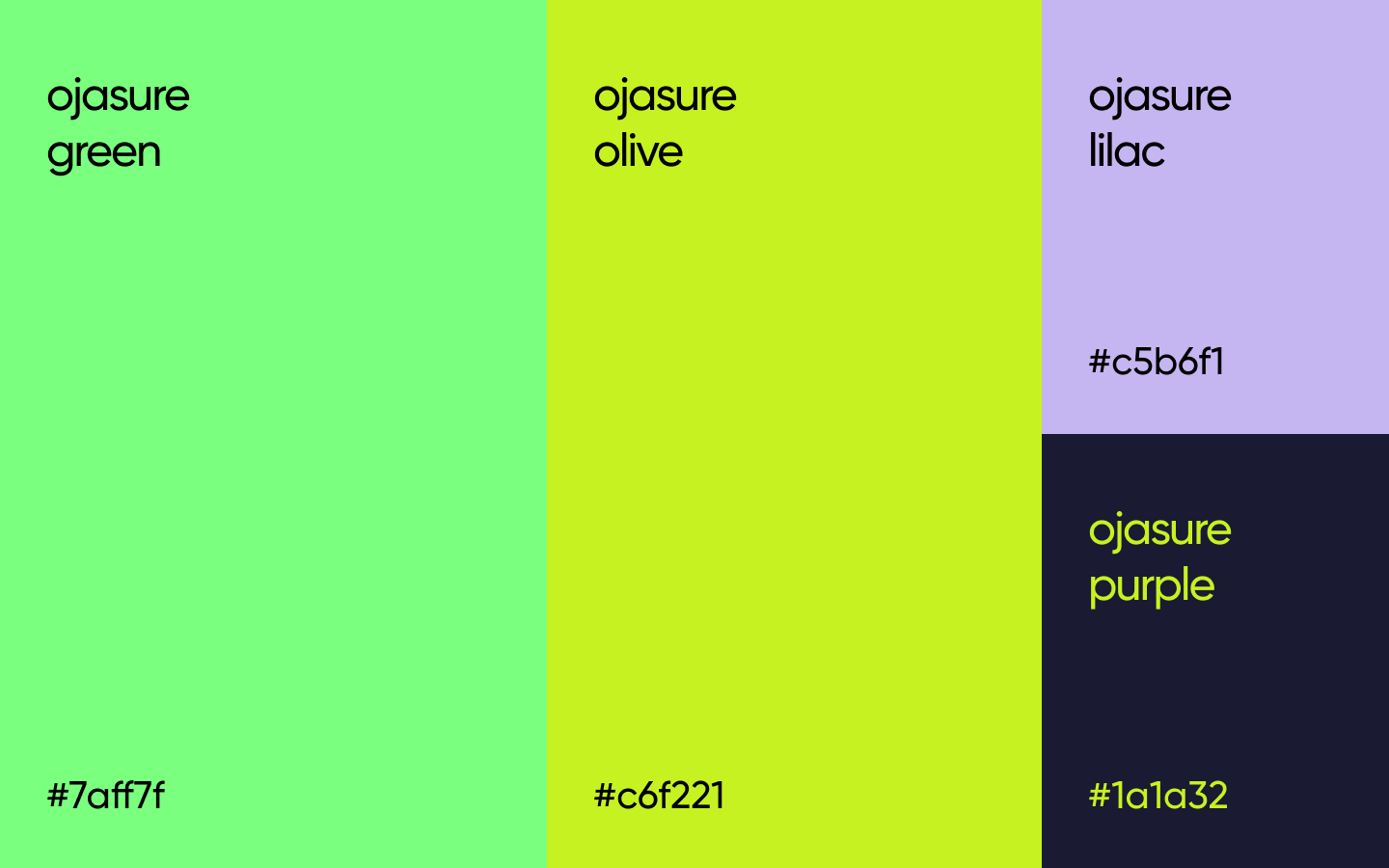
The visual direction combined expressive colours with a darker foundation to create contrast and a recognizable product identity.
The palette included:
Green — #7AFF7F
Oil — #C6F221
Lilac — #C5B6F1
Purple — #1A1A32
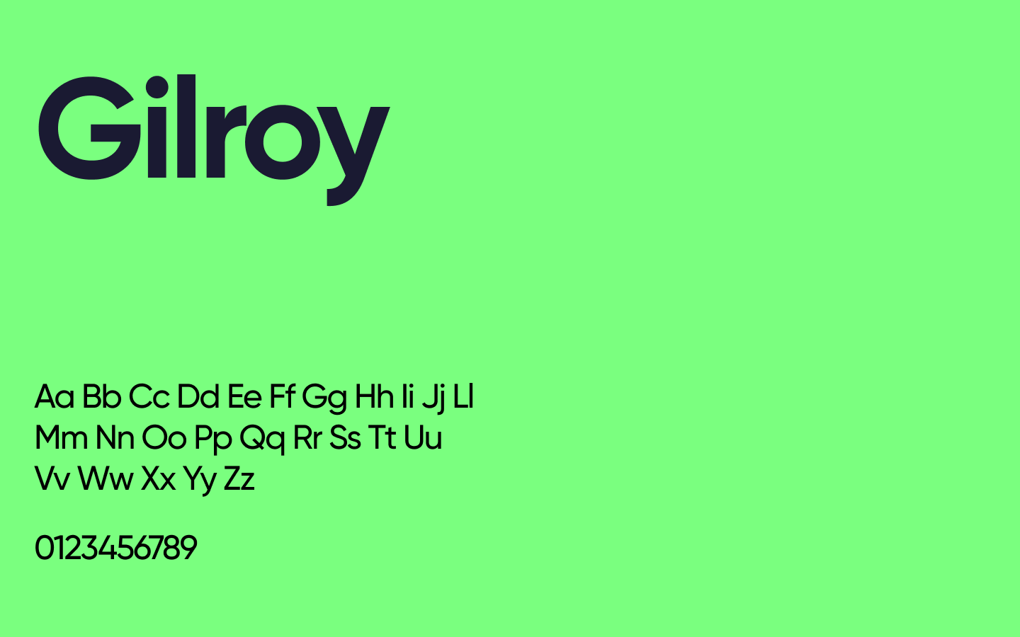
General Sans was selected as the primary typeface.
Rather than using every colour with equal prominence, the system needed defined roles for primary actions, secondary elements, backgrounds, and interface feedback.
This helped establish consistency while allowing the brand to retain its personality.
Stage 03 — UX audit and interface evaluation
Alongside the identity work, I reviewed the existing product interface.
The evaluation focused on how information was organized, how users moved through the application, and whether interactive elements communicated their purpose clearly.
Several areas required attention:
Navigation clarity
Active navigation states needed to be easier to distinguish so users could understand their current location within the product.
Information hierarchy
Different types of content needed clearer visual separation, particularly where product details and supporting information appeared together.
Interaction feedback
Actions such as saving a favourite needed recognizable feedback so users could understand whether an interaction had been successful.
Touch targets
Interactive elements needed sufficient space to support comfortable mobile use.
Map-based information
Where market information appeared on maps, the presentation needed to account for the density of location markers and the readability of the interface.
These observations helped guide the redesign beyond visual styling.
Stage 04 — Redesigning the product experience
The next stage involved translating the UX observations and brand direction into updated interface designs.
I worked on improving the consistency of components, clarifying the hierarchy of information, and refining important product interactions.
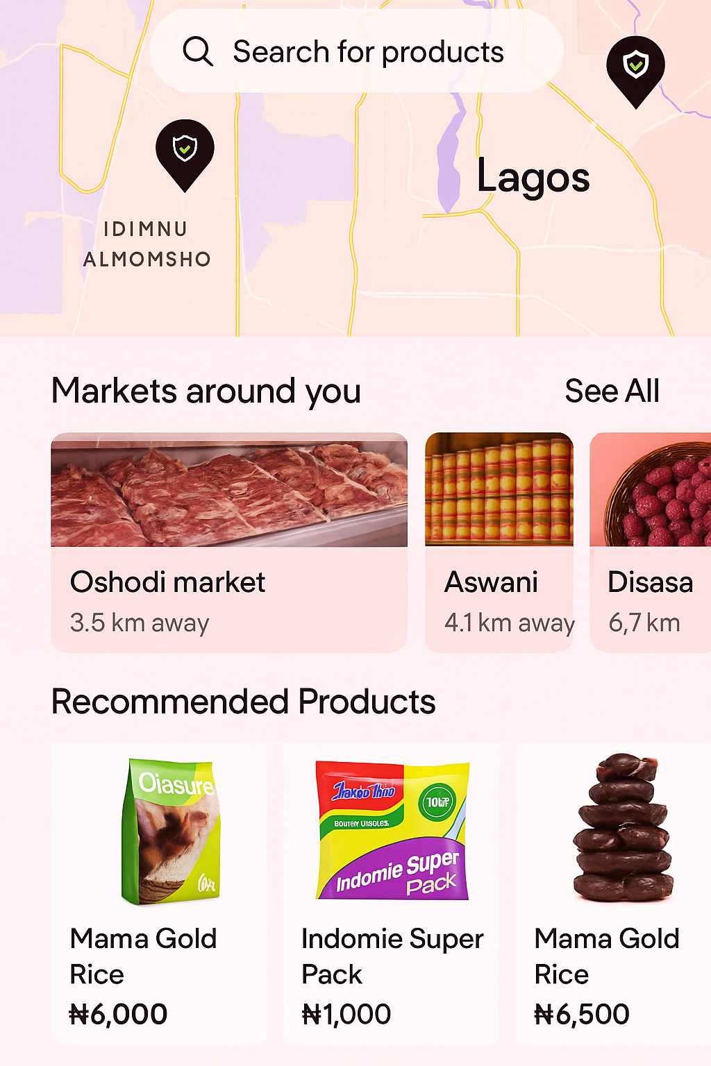
The redesign considered how buyers would inspect products, understand availability, and identify the appropriate person to contact.
Product specifications were particularly important.
For example, an item might have different configurations, such as colour or RAM, and those variations needed to be represented clearly.
The interface also needed to communicate which markets had the product available.
These details influenced the structure of product information and the relationship between discovery and the next step in the purchasing journey.
Stage 05 — Stakeholder review and iteration
Throughout the engagement, the OjaSure team reviewed the designs and provided feedback on the intended product behaviour.
Some of this feedback involved important changes to how information should appear.
For example, discussions addressed whether the experience should include onboarding or proceed directly to login, how experts should be identified, and how market and buyer names should be displayed.
There were also decisions about which product details should be visible, including a request to remove price information from a particular design.
These reviews helped refine the experience around the client's intended workflows rather than treating the initial designs as final.
Stage 06 — Design system and handoff
As the designs progressed, I worked on establishing a more consistent set of interface components and visual rules.
The design system covered typography, colour usage, buttons, component states, spacing, and other recurring interface elements.
This was important because OjaSure involved more than one digital surface.
The mobile application and admin dashboard needed to feel related, even when supporting different user activities.
The final design phase focused on refining the screens, incorporating feedback, and preparing the work for development handoff.
Key Design Decisions
Making the experience clearer without removing its complexity. 01. Give brand colours specific responsibilities
The decision
Use the refreshed colour palette as a structured interface system rather than applying the colours decoratively.
Why
OjaSure's visual identity needed to be expressive, but the product also required clear distinctions between primary actions, supporting information, and interface states.
The approach
Define colour roles, establish contrast, and use typography and spacing to maintain hierarchy.
This helped connect the brand identity with the functional requirements of the interface.
02. Make navigation states more visible
The decision
Improve how the interface communicates the currently active section.
Why
Navigation is more useful when users can understand both where they can go and where they currently are.
Without clear active states, users may need to rely on memory or repeated exploration.
The approach
Strengthen visual distinctions between active, inactive, and interactive navigation elements.
03. Treat product specifications as essential information
The decision
Account for product variations and availability within the product experience.
Why
Products such as electronic devices may have multiple configurations.
A buyer needs to understand the relevant attributes before determining whether an item meets their requirements.
The approach
Consider how variations such as colour and RAM could be presented alongside market availability without overwhelming the interface.
04. Make the people behind the transaction identifiable
The decision
Refine how the interface presents experts and other participants involved in the marketplace experience.
Why
OjaSure's product flow involves more than displaying items.
Users may need to understand who they are connecting with and which market or buyer a particular interaction relates to.
The approach
Use clearer naming and information presentation to distinguish the relevant people and market context.
05. Respond to changing product requirements
The decision
Revise interface details when stakeholder feedback clarified the intended workflow.
Why
Design exploration often exposes differences between initial assumptions and the actual product requirements.
For OjaSure, feedback affected onboarding, product information, and the visibility of certain details.
The approach
Incorporate agreed changes while maintaining consistency across the wider experience.
06. Build reusable components
The decision
Establish a design system rather than treating each screen as an isolated composition.
Why
A product with multiple screens and an administrative dashboard requires consistent patterns.
Reusable components can reduce visual inconsistencies and make future changes easier to manage.
The approach
Define typography, spacing, colours, buttons, interaction states, and recurring UI patterns within Figma.
Evidence of Work
From a refreshed identity to a more coherent product interface.
The OjaSure engagement brought together brand design and UX/UI work across multiple deliverables.
Brand exploration
I developed moodboards, explored visual directions, and prepared initial logo concepts informed by the project's discovery stage.
Visual identity
The refreshed direction used General Sans and a distinctive palette of green, oil, lilac, and deep purple.
The system was developed to create consistency across the product and supporting brand materials.
UX audit
I reviewed the interface for opportunities to improve navigation, information hierarchy, interactive feedback, touch targets, and map-based presentation.
Mobile application redesign
I worked on updated mobile interfaces, including product-related experiences and interactions shaped by stakeholder feedback.
The design discussions addressed product configurations, market availability, expert identification, and the information users needed at different stages.
Administrative dashboard
The project scope also included redesign work for OjaSure's administrative experience, extending the updated design language beyond the consumer-facing application.
Component system
I developed and refined reusable interface patterns, including typography styles, colour roles, button treatments, spacing, and interaction states.
Stakeholder collaboration
I worked through multiple rounds of feedback, adjusting the designs as the team clarified requirements and preferences.
Design handoff
The engagement included preparing the updated Figma designs and supporting visual guidelines for the development team.
Outcome & Reflection
A more unified direction for the OjaSure experience.
The engagement produced a refreshed brand direction and redesigned interface work for OjaSure's mobile application and administrative dashboard.
The work established a more consistent visual foundation and addressed several usability concerns identified during the design review.
It also brought greater attention to the details that matter in marketplace experiences: how products are described, how availability is communicated, how people are identified, and how users understand their next action.
The designs went through stakeholder review and were prepared for development handoff.
I remained interested in the product's development progress after the design engagement, but I don't have verified evidence of the final release status or post-launch performance.
For that reason, I would not claim measurable improvements in conversion, usability, retention, or adoption.
The documented outcome is the completion of the design engagement and the delivery of a refreshed identity and product-interface direction.
What I learned
Brand identity and user experience should reinforce each other.
A distinctive visual language can help a product stand out, but it must also support readability, hierarchy, and usability.
Small interaction details matter.
Active navigation states, touch targets, and feedback after an action may seem minor, but they influence how confidently people use a product.
Marketplace design requires contextual thinking.
A product listing is not simply a photograph and a title.
Specifications, availability, locations, and the people involved in a transaction all contribute to the user's understanding.
Stakeholder feedback is part of product discovery.
Requirements become clearer as teams review actual designs.
Being able to revise an interface without losing consistency is an important part of the design process.
Design systems make complex products easier to maintain.
A shared set of components and visual rules becomes especially valuable when a product spans multiple screens and user experiences.
Closing thought
Good marketplace design makes more than products discoverable. It makes the next step understandable.
OjaSure gave me the opportunity to work at the intersection of brand identity and digital product design.
It reinforced the importance of creating experiences that are visually recognizable, functionally clear, and flexible enough to evolve as product requirements become better understood.
Brand Identity · UX/UI Design · 2025